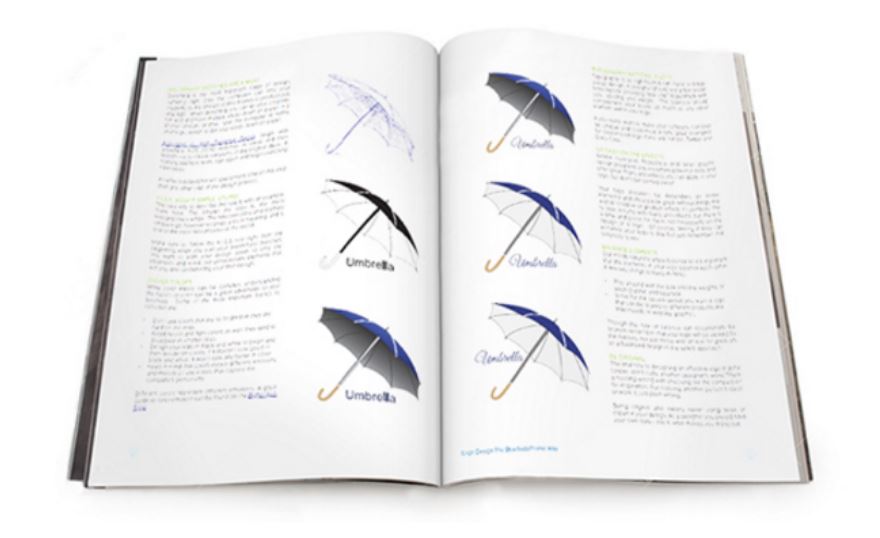
Design Principles
Axis Principle
Axis is the most basic and most common organizing principle. Simply stated, axis is an imaginary line that is used to organize a group of elements in a design. In diagrams, axis is represented as a dashed line. Where is axis in the worst website?
Alignment
Axis is mainly used to align elements. When elements are arranged around an axis, the design feels ordered. As with most things in life, we enjoy things that are ordered because they feel more stable, comfortable and approachable.
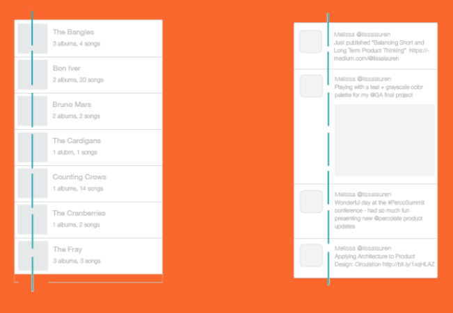
A simple example of axis is the descriptions shown at Crypton. In this design, a vertical axis neatly aligns descriptions on the left side of the screen while visuals appear in what is called a parallax effect on the right.
Reinforcement why? what
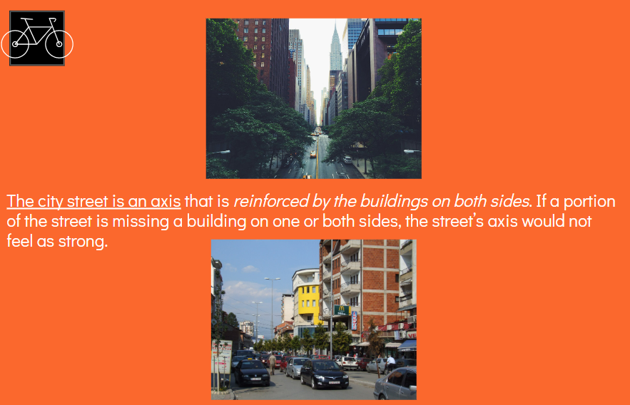
Although axis is an imaginary line, you can make it more apparent if the edges of surrounding elements are well defined. A common example of this concept in architecture is a city street. The city street is an axis that is reinforced by the buildings on both sides. If a portion of the street is missing a building on one or both sides, the street’s axis would not feel as strong.
An example of this in product design is the timeline in the Twitter app. In this design, a vertical axis helps define a section for avatars on the left and a section for tweet content on the right.
Movement
When we encounter something linear, such as an axis, we naturally follow the line in a direction. If we arrive on a street, we walk down the street. If we open an elevator into a long hallway, we walk down the hallway. Lines prompt movement and interactions. The direction of movement depends on the end points. A defined end point signals a place to start or stop.
An axis that encourages movement is the music scrubber in the SoundCloud app. In this design, you recognize the scrubber as a left-right axis, and naturally slide the scrubber to the right until you reach the end of the song.
Continuous
If an end point is undefined, you will follow the axis until you reach something of interest or are tired of interacting with the axis. While the concept of an undefined end point in architecture is uncommon since it’s difficult for something architectural to go on forever, it’s becoming more popular in product design with infinite scrolls.
An example is an infinite scroll is the main feed in the Pinterest app. In this design, the vertical axis starts at the top of the screen then continues downwards without a stopping point. This encourages you to scroll down the page for as long as you’re interested in viewing pins. Also archive.
Symmetry Principle
Symmetry is when elements are arranged in the same way on both sides of an axis. Perfect symmetry is when elements are mirrored over the axis and exactly the same on both sides.
Balance
Symmetry adds balance to a design. When elements are the same on both sides of an axis, the design feels harmonious. If we design a street with five houses on one side and five on the other, walking down the street would feel comfortable because the arrangement of homes is balanced.
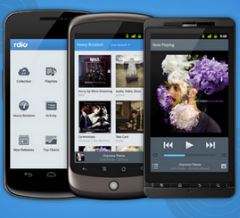
An example of symmetry is the arrangement of music covers in the Rdio app. Elements on both sides of the screen are the same format. This type of layout is easy to read top to bottom and left to right.
Asymmetry
Designs are asymmetrical if the arrangement of elements are different on both sides of an axis. If we design a street with five houses on one side and one on the other, the street will feel unbalanced and perhaps uncomfortable.
An asymmetrical design is the feed in the Pinterest app. Although the left and right columns are the same width, the height of elements in each column varies. The variances make it difficult to scan from left-right. Even the slightest bit of asymmetry can throw off the balance and comfort in a design.
Hierarchy
Hierarchy is when an element appears more important in comparison to other elements in a design.
Size
An element will appear more hierarchical if it is larger than other elements in a design. We naturally look first at the largest element in a design. If there are five windows on the front of a building, and one is twice the size of the others, our attention will focus on the biggest window first.
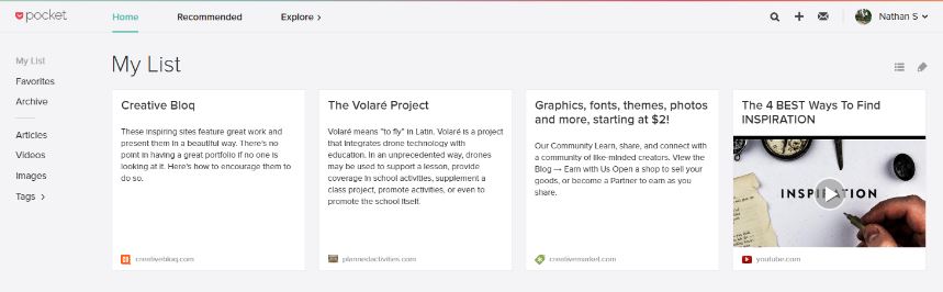
An example of hierarchy by size is the article list in the Pocket app. The header article is featured at the top, with a larger picture. Due to it's size, it catches our attention first.
Shape
An element can also appear more hierarchical if it is different than other elements in a design. We naturally look first at the irregular shape in a design. If there are five of the same windows and one door on the front of a building, our attention will focus on the door first.
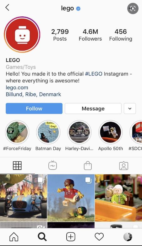
An example of hierarchy by shape is the profile page in the Instagram app. The circular profile picture is distinctly different than the square instagrams. We recognize the profile picture as something unique and more important.
Placement
Last but not least, we can place elements in more hierarchical positions. Within a circle, the center is the most hierarchical. The end of an axis is naturally more hierarchical than points along the line.
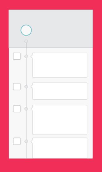
An example of hierarchy by placement is the timeline in the Path app. The avatar is the starting point of a long axis, and therefore has a higher level of importance than the avatars on the left in the stream.
Rhythm Principle
Rhythm is the movement created by a repeated pattern of forms.
Pattern
The best way to understand rhythm is to think of a song. Songs have rhythm when a piece of the song repeats. When listening to a song with good rhythm, we recognize the pattern and begin to expect beats.
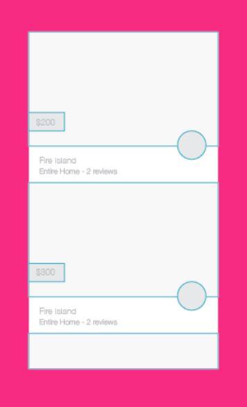
An example of rhythm in product design is the Airbnb app. In this feed, each listing is displayed with a picture, price, location and owner avatar. When scanning the feed, you begin familiar with the rhythm and know exactly where to look for elements in the pattern, such as price.
Breaks
A break in rhythm will appear more hierarchical. Think about a song. When a song has a repeated rhythm and the rhythm is broken, something quite special usually happens.
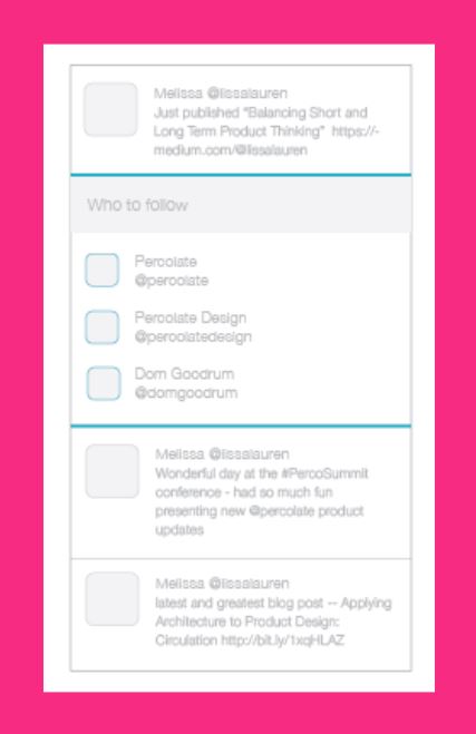
In the Twitter app, the profile feed has a rhythm and is broken by a section with suggestions of people to follow. This break appears more hierarchical and is a good way of grabbing your attention.
Back to Homepage